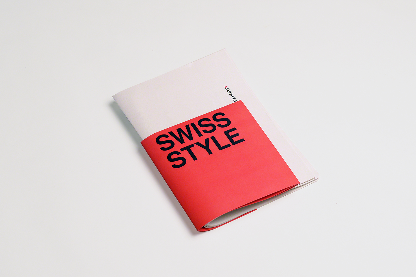
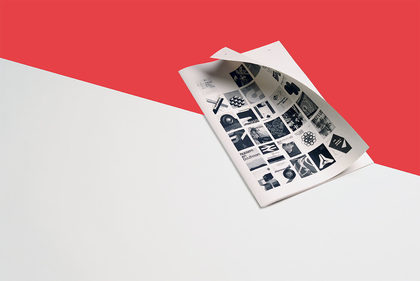
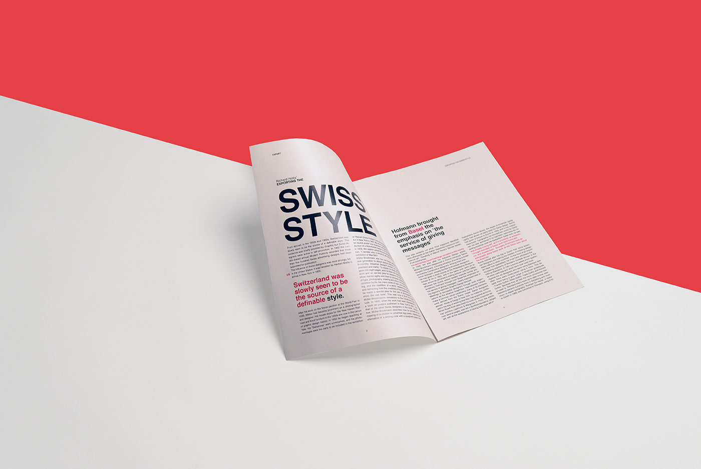
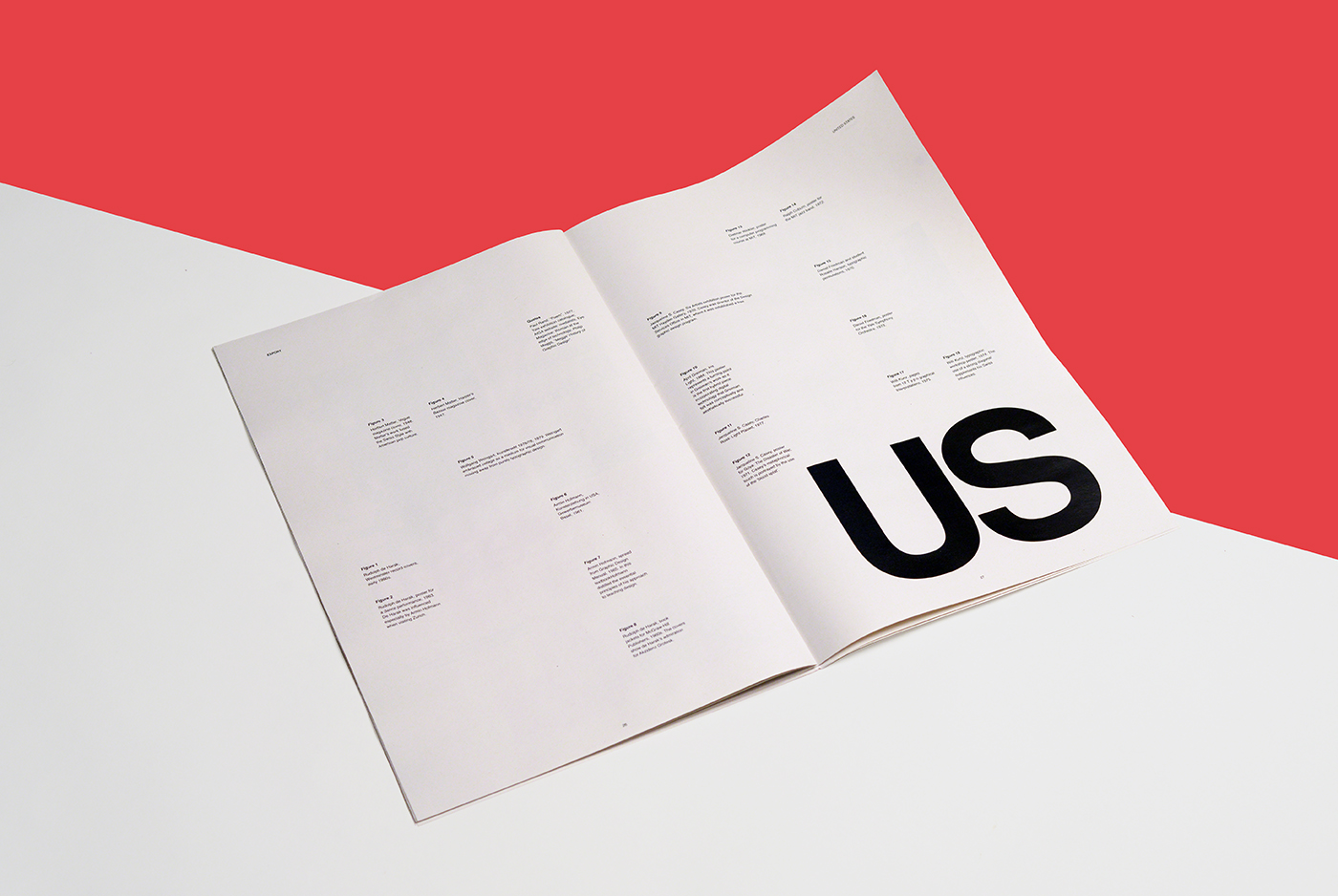
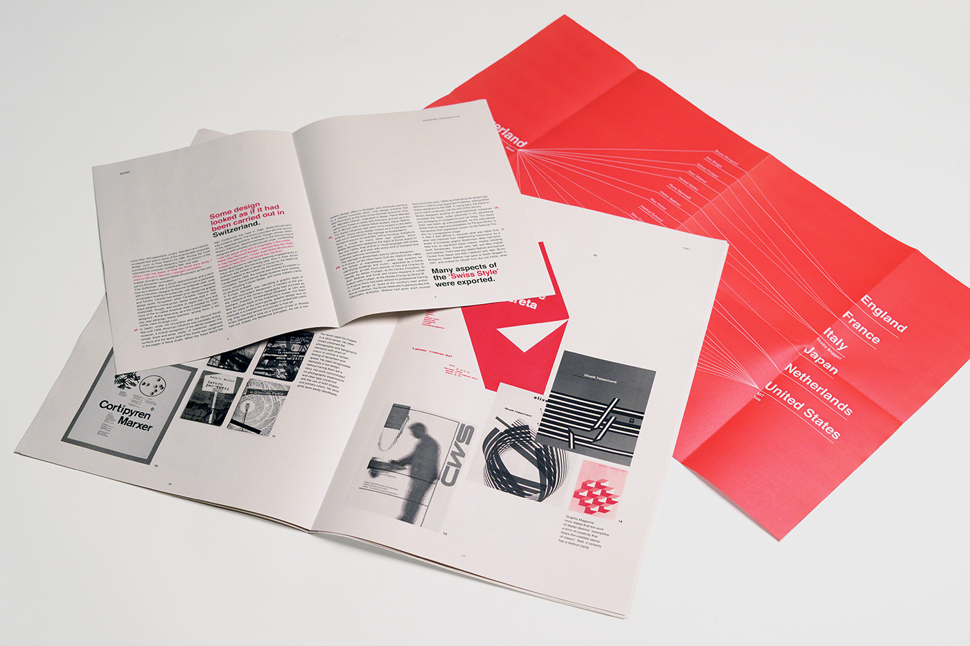
A periodical publication that focuses in The Basel School of Design and its role on the propagation of the Swiss Style across the world and the ideals defended by its protagonists. The choice of color, typography and mainly the strict and defined grid throughout the pages, evoke the style that is tried to extol.
[created w/ Inês Bacalhau]
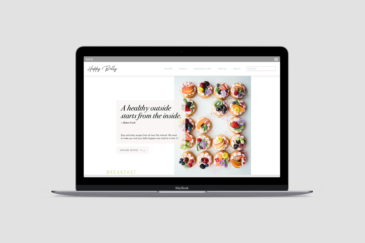
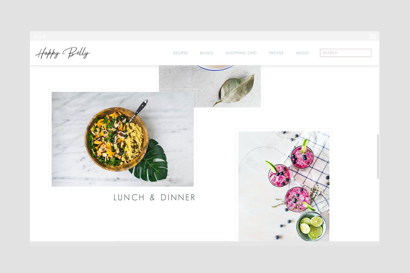
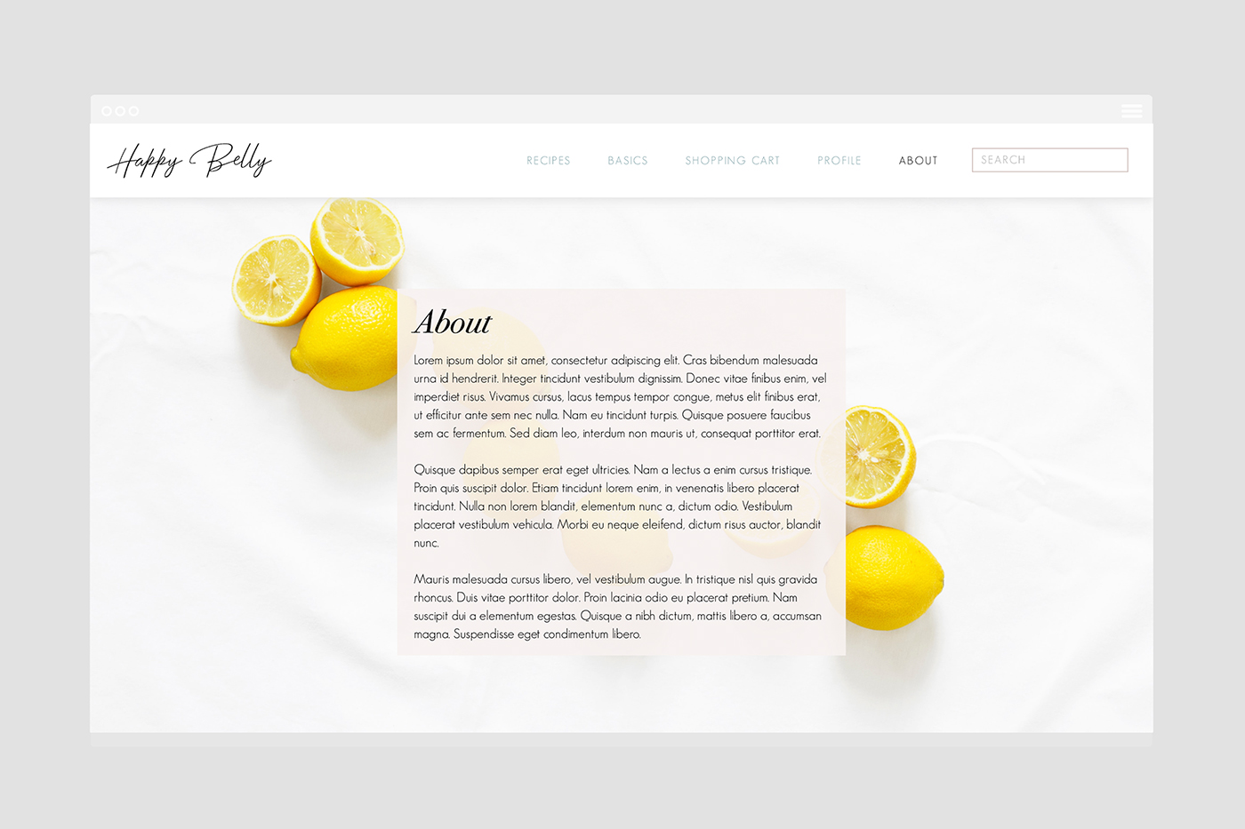
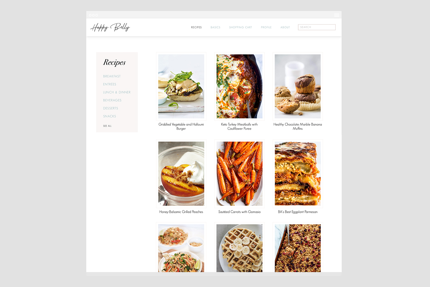
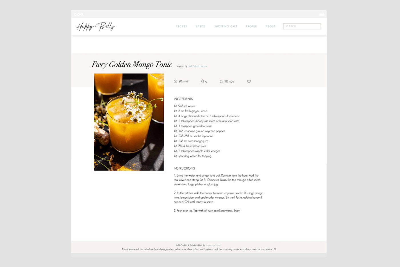
A website that gathers recipes from all over the internet and focuses on a healthier living. You can navigate the recipes by categories and create your own shopping cart for an easier next trip to the supermarket.
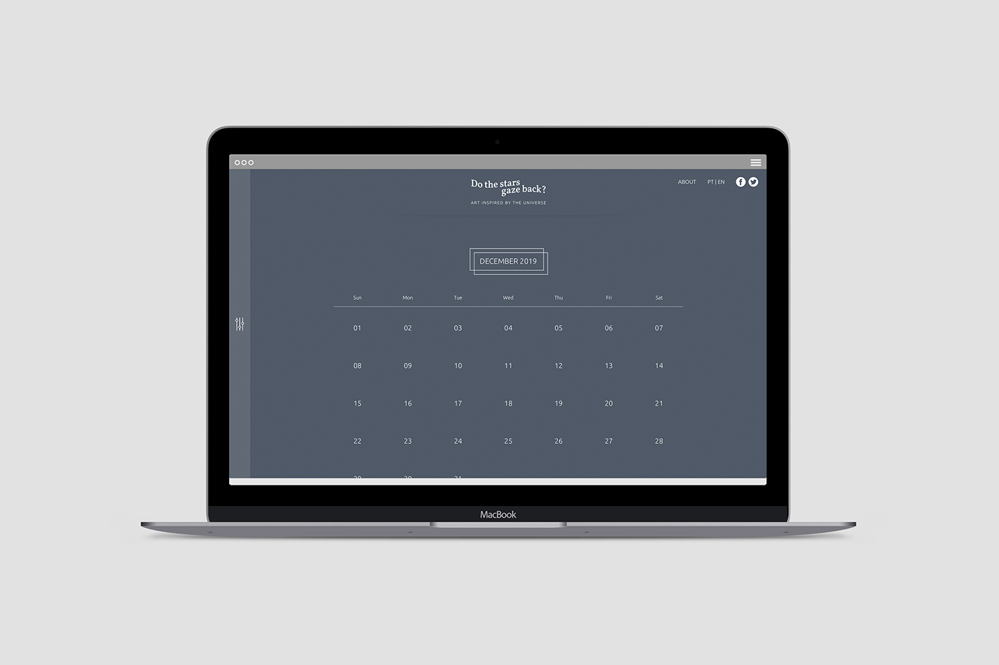
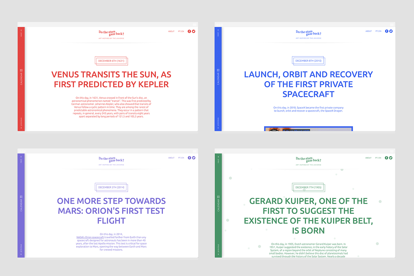
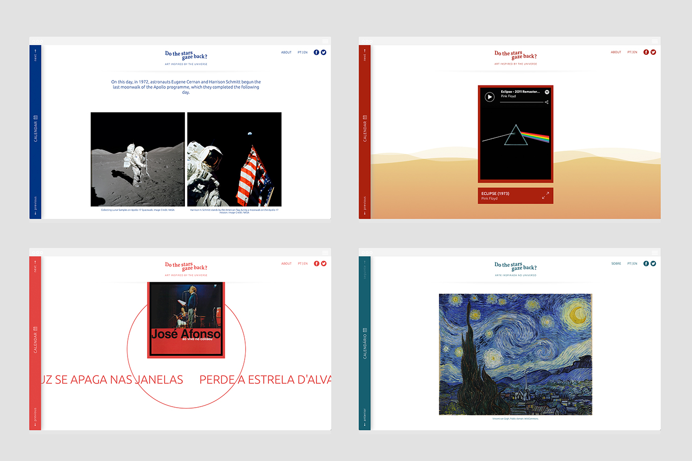
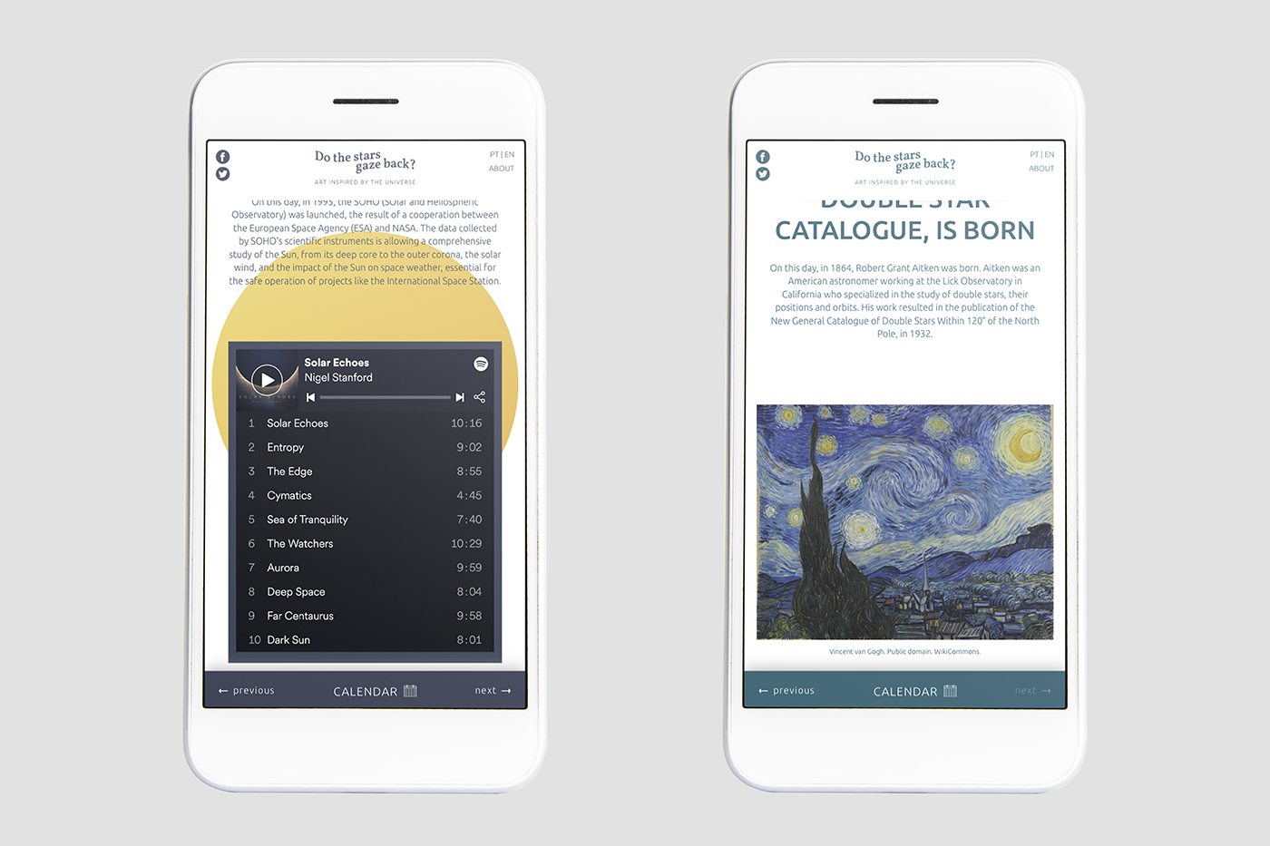
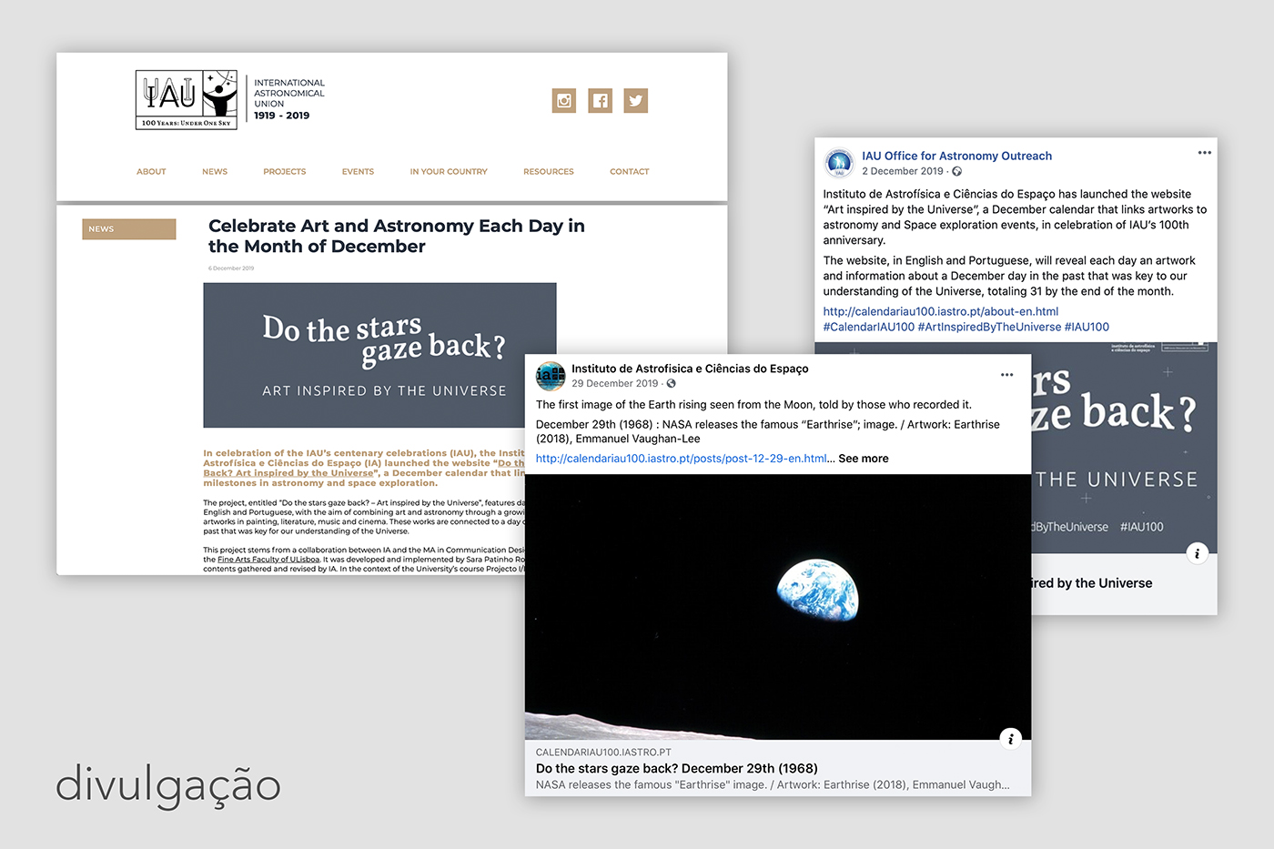
The project creates a bridge between art and astronomy through an archive of works with origins in painting, literature, music and cinema. It links each work to a milestone event in the history of astronomy and space exploration. As a journal, it consists of a 31-publication-archive, that shows how art can be a powerful tool to communicate science.
[created w/ IAstro]
go to website >>
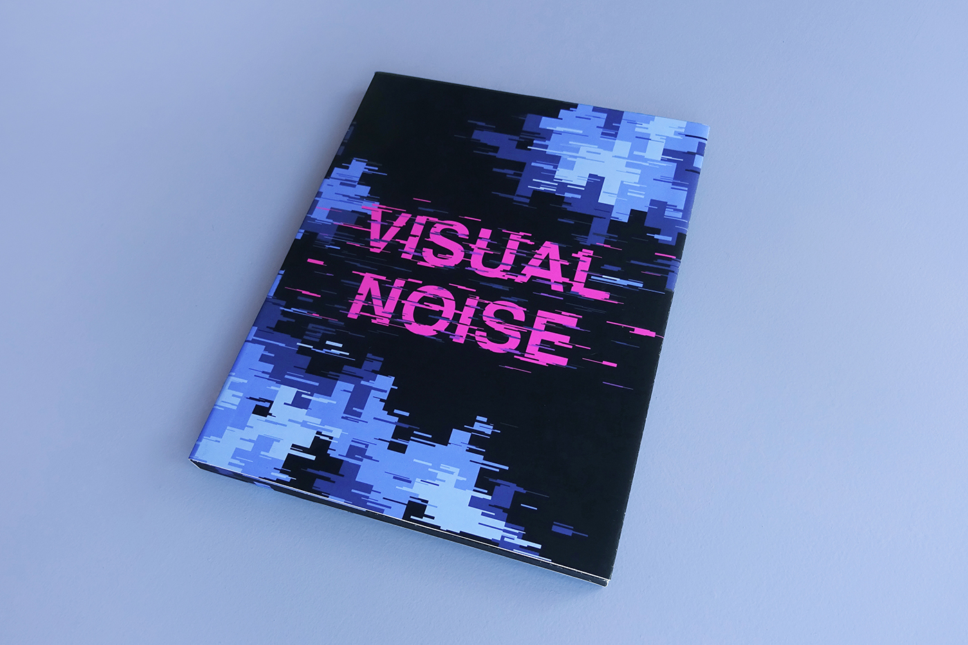
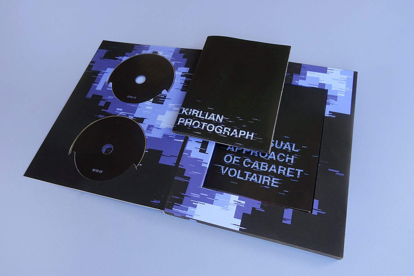
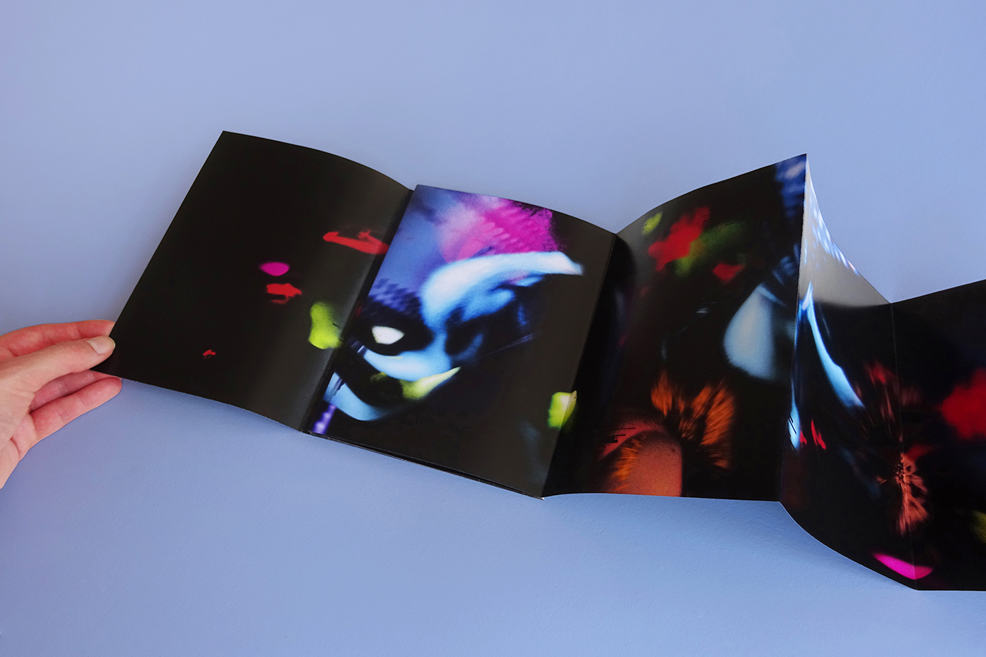
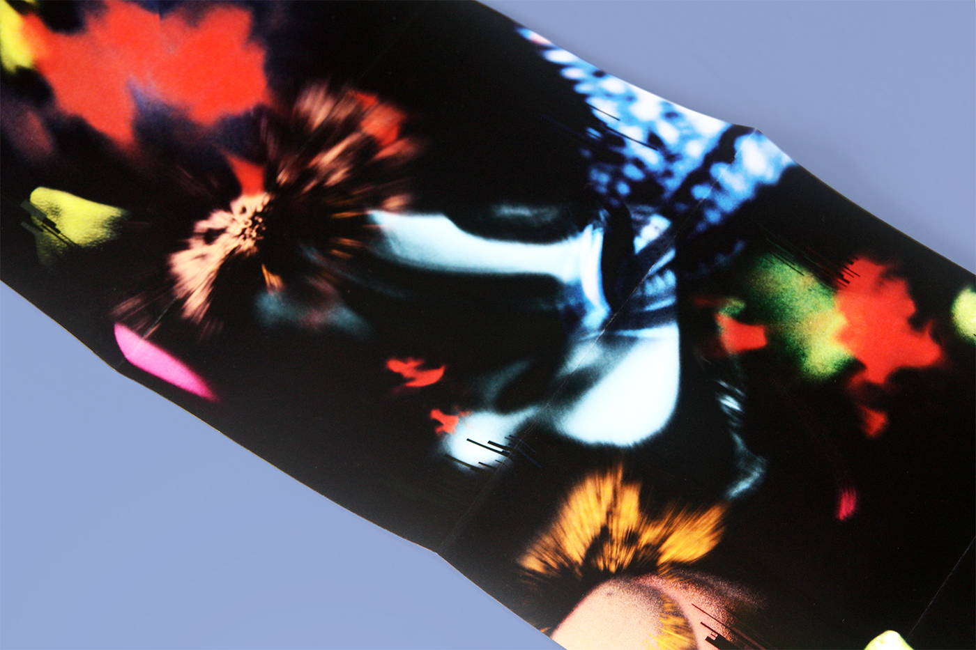
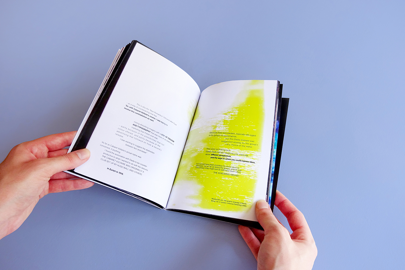
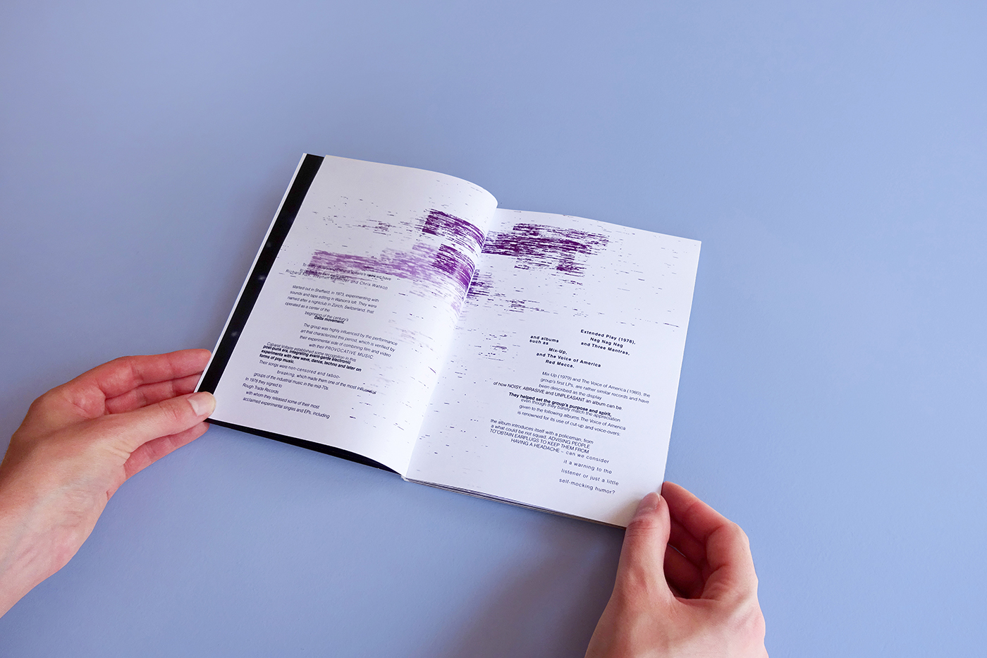
A project that explores the band Cabaret Voltaire and the video clips of their experimental phase. The visual identity of the various objects was achieved mainly by using video textures, visible in the composition of the box, lettering and predominantly in the foldable piece, which is a visual interpretation of the song “Kirlian Photograph”.
[created w/ Beatriz Sapata & Raquel Sancho]

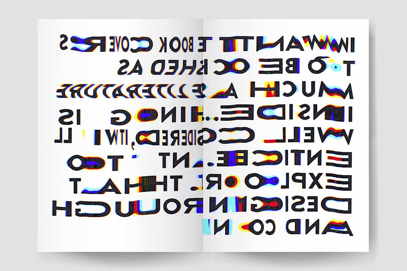
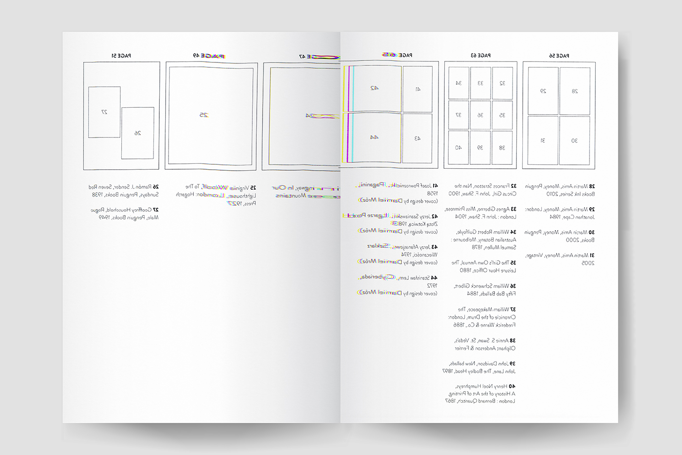
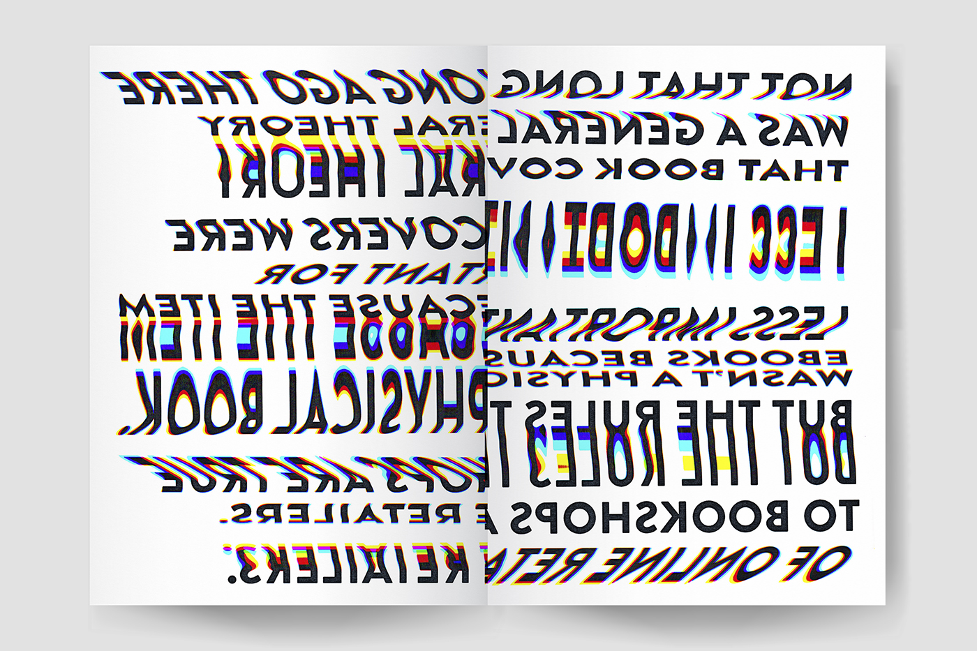
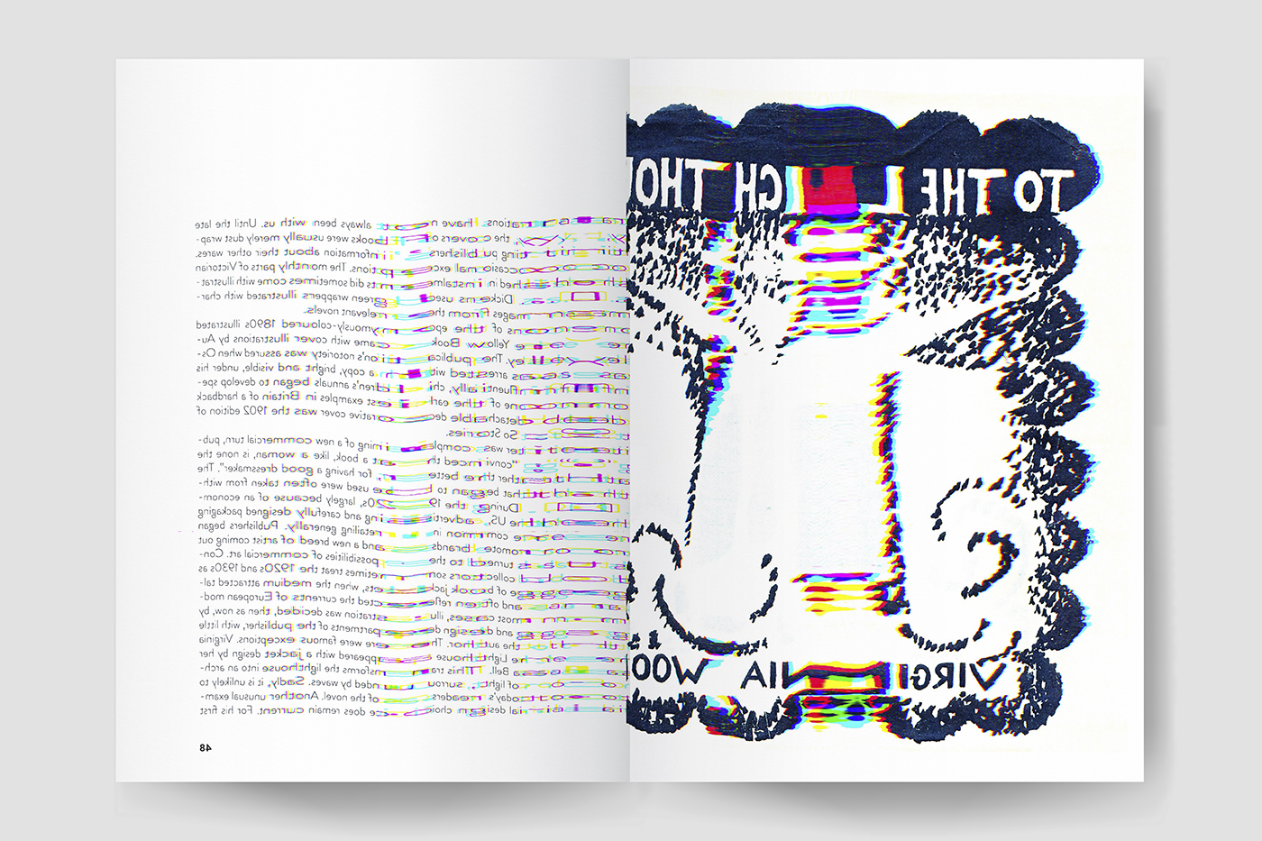
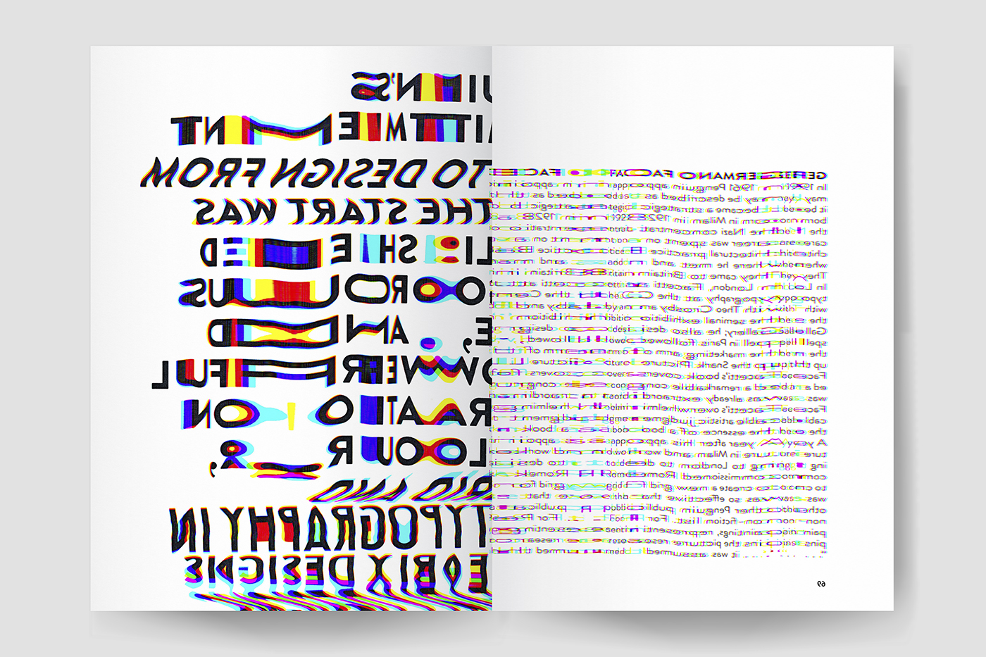
The project aims to question the form of the book and highlight why it’s not always so bad to judge a book by its cover. The resulting object is a metaphor of a book turned inside out, where all the content got distorted by this physical process. Alongside it, a smaller object gathers a collection of grids from the most famous book covers ever created.
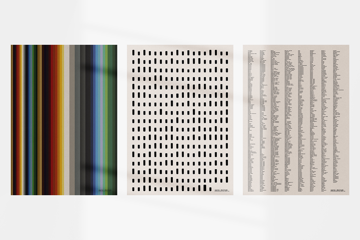
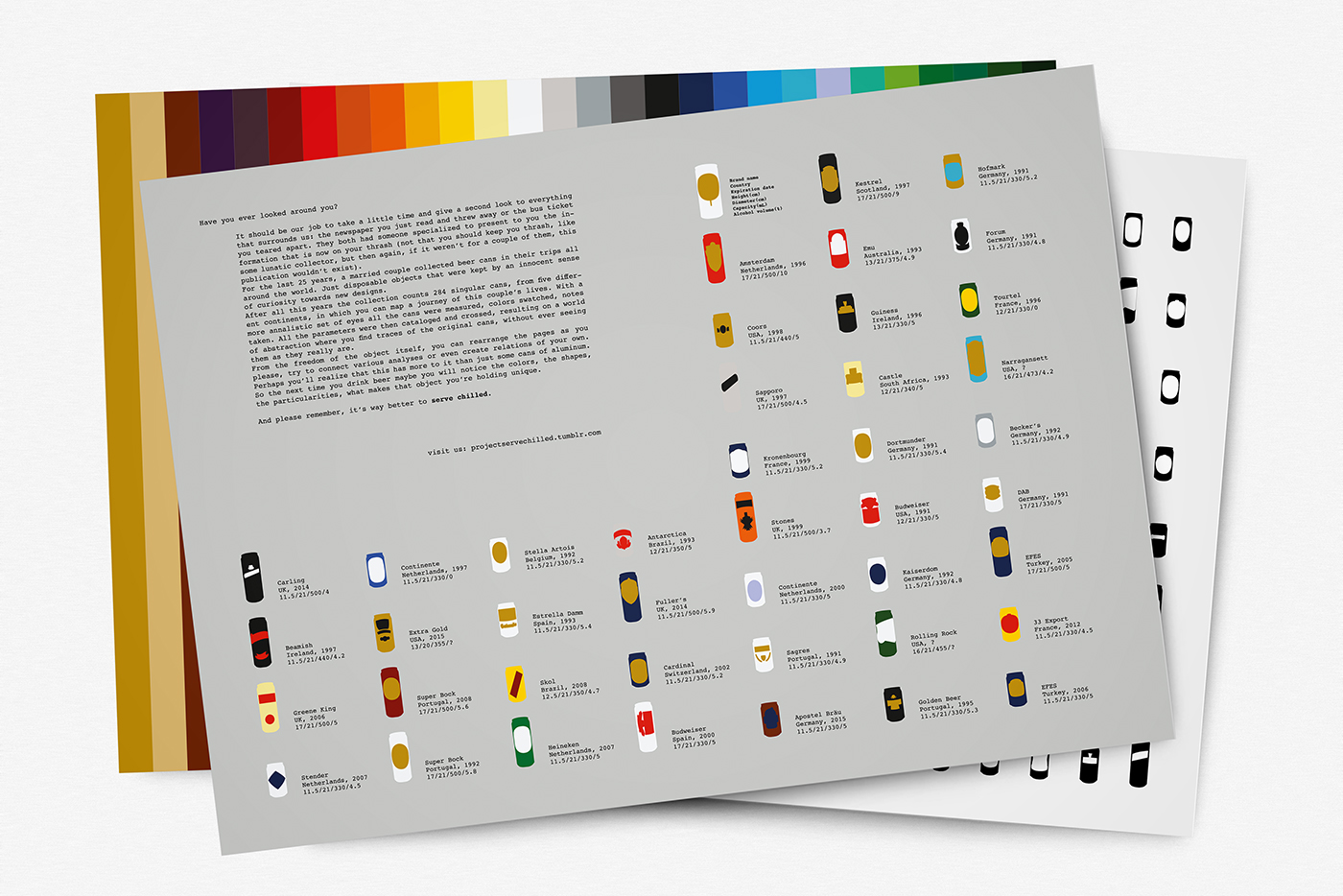
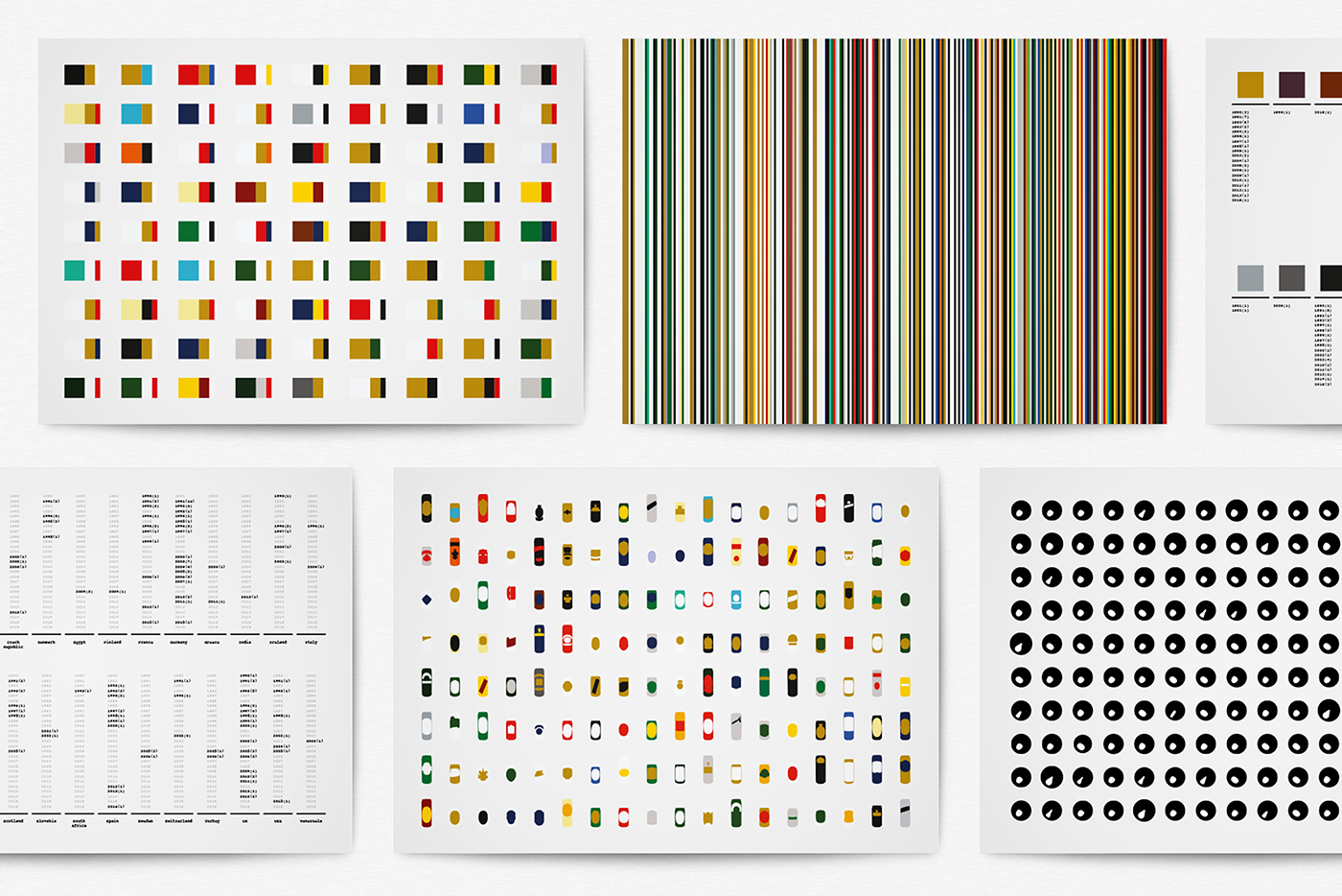
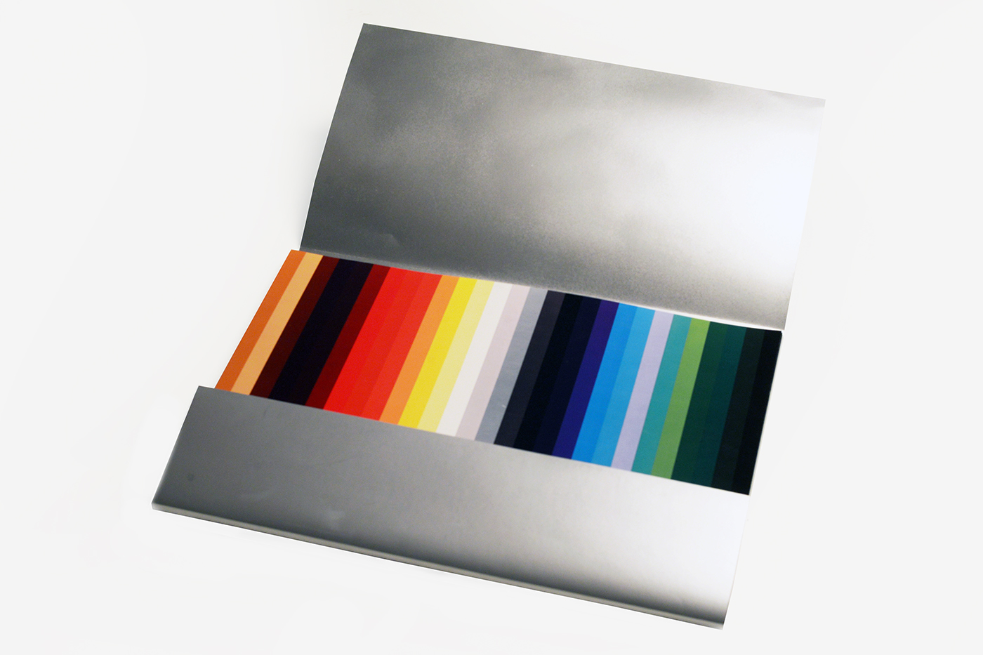
For the last 25 years, a married couple collected beer cans in their trips all around the world. The collection of 284 singular cans was analysed and cataloged in a world of abstraction where you find traces of the original cans, without ever seeing them as they really are. From the freedom of the object itself, you can rearrange the pages as you please, connect various analyses and create relations of your own.
[created w/ Inês Bacalhau]
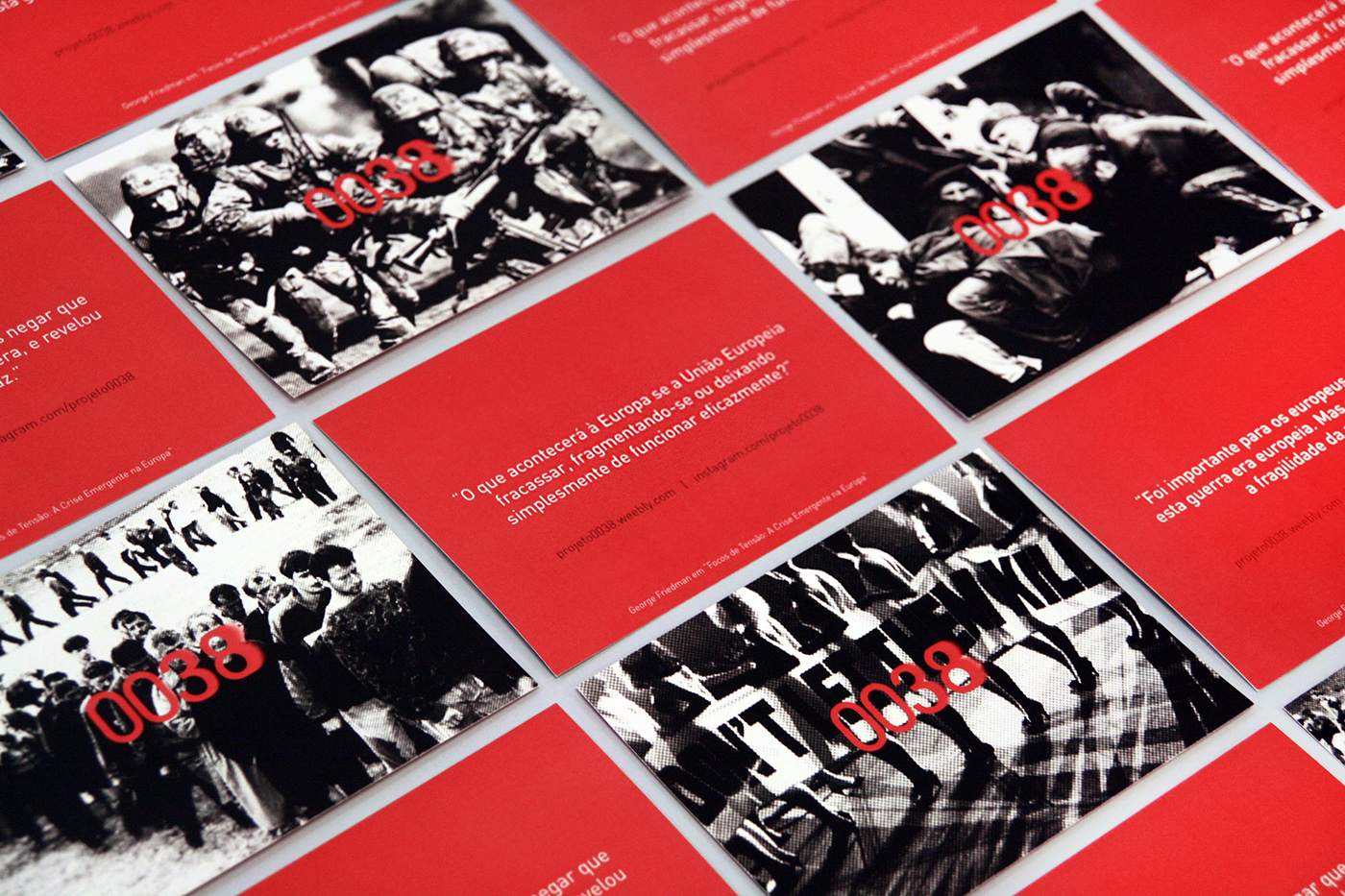
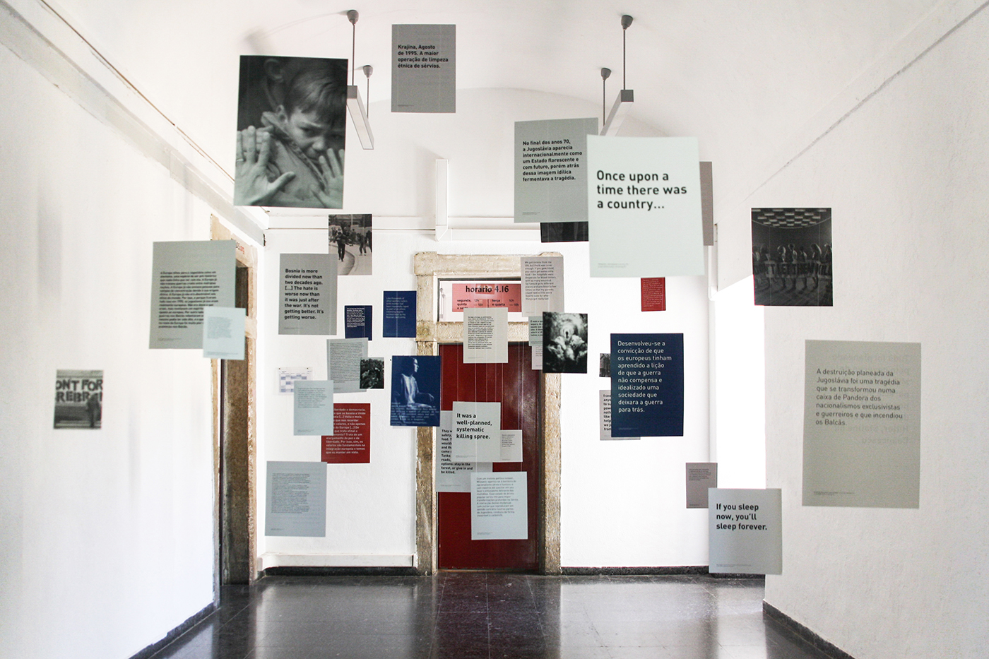
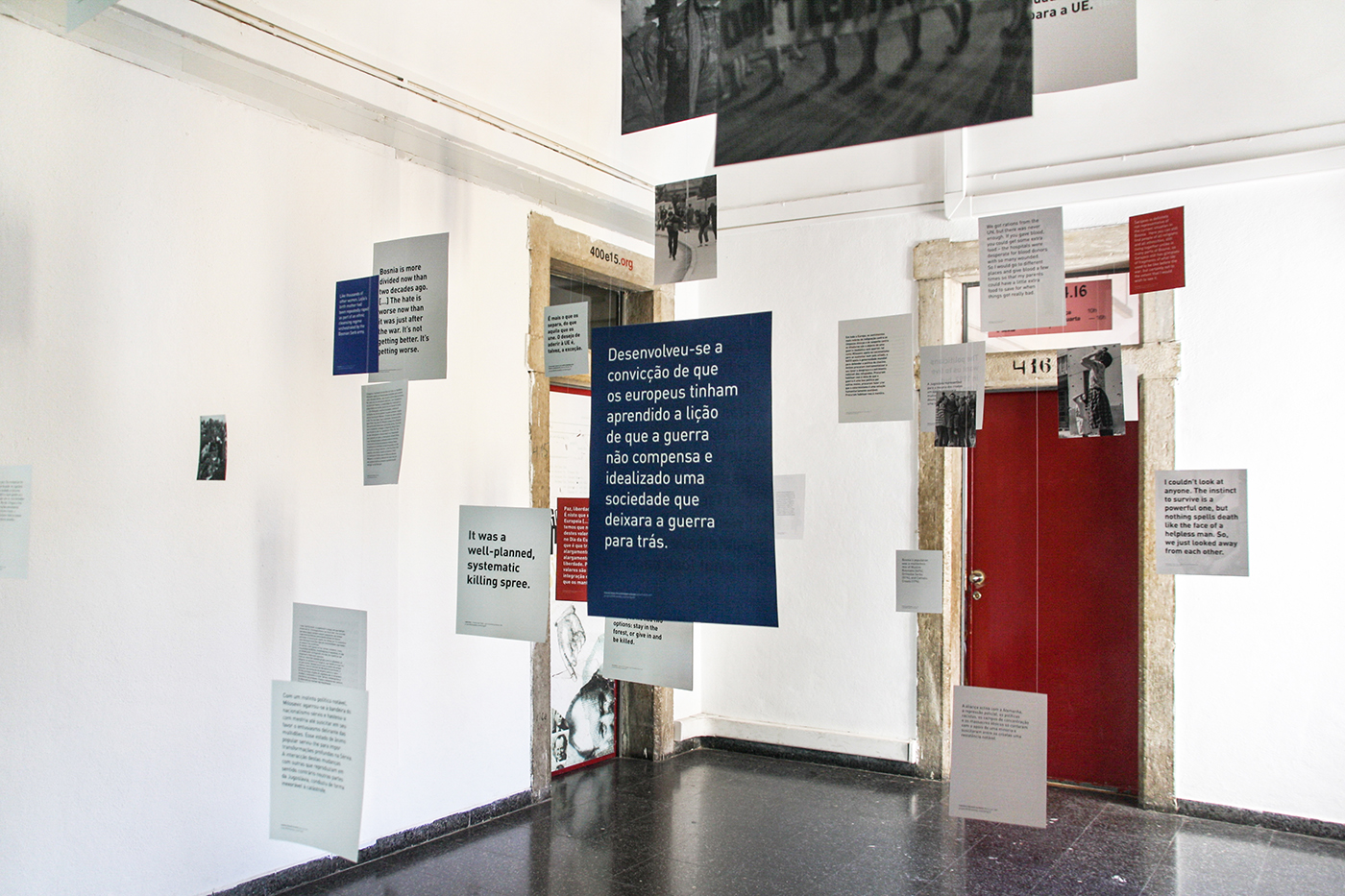
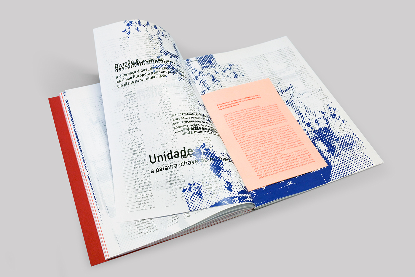
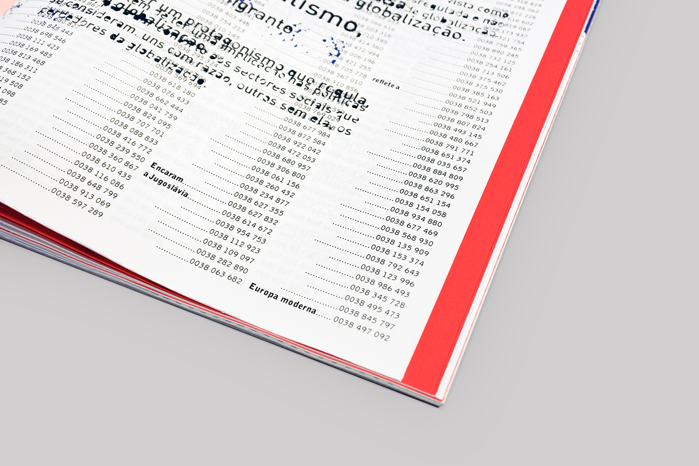
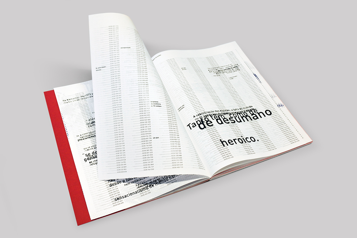
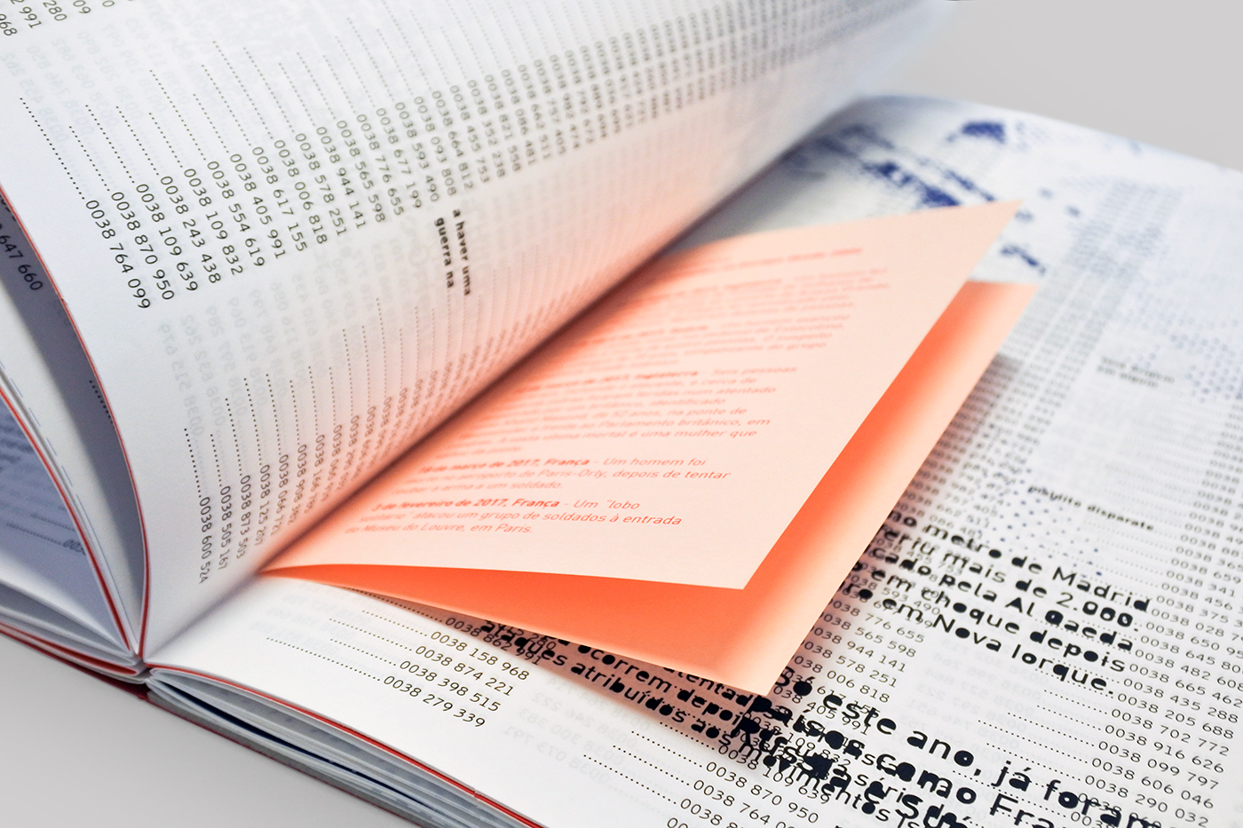
The project was named after Yugoslavia’s calling code, representing the conflicts associated with this country that shocked the world in the 90s. A phase of research resulted in a website that works as a chronological archive; later it was created an installation which tells the story of the people who lived this war; and lastly, an editorial object highlights the similarities between this reality and the Europe of today.
[created w/ Beatriz Sapata & Raquel Sancho]

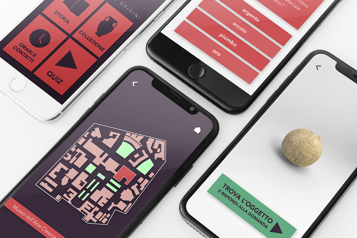
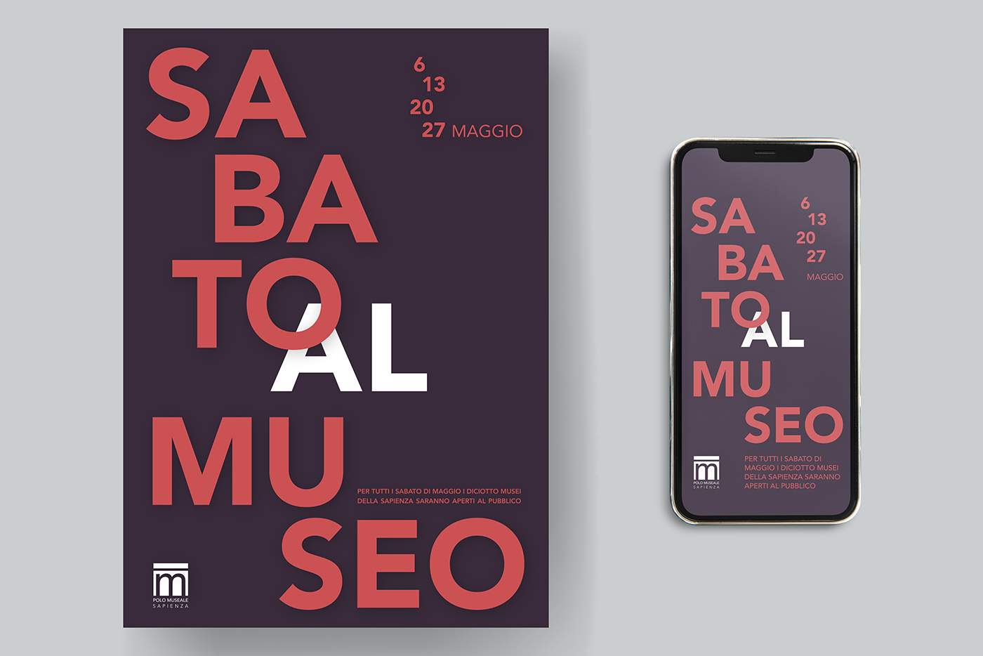
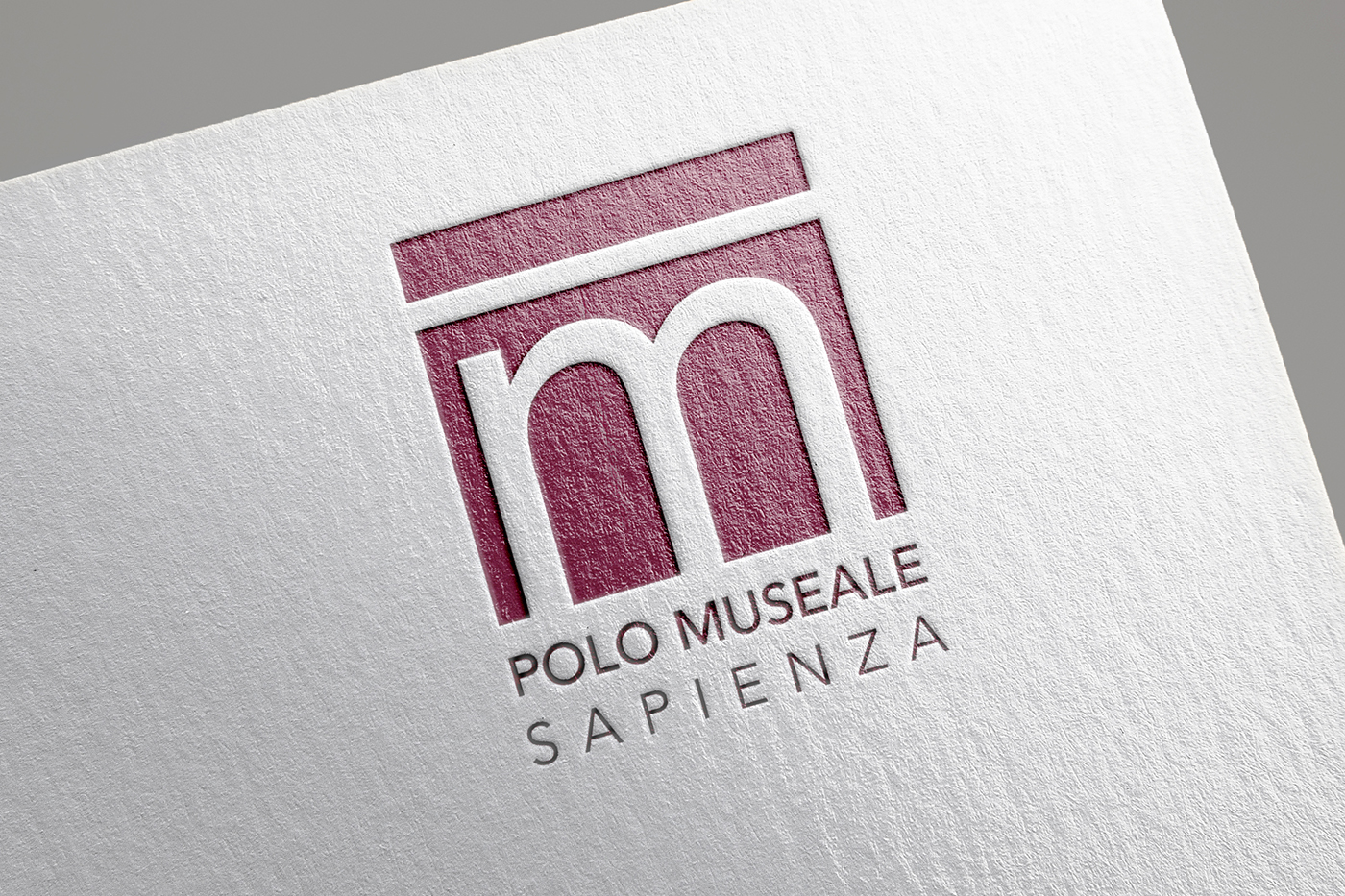
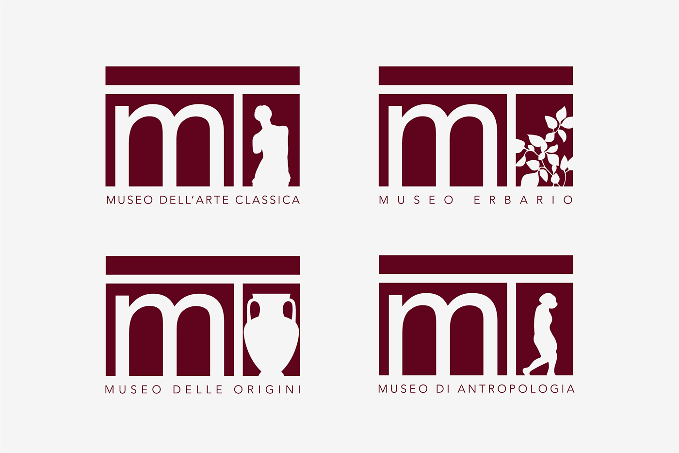
The project was created for the “Polo Museale” of the University of Rome “La Sapienza” with the purpose of praising the various museums within the campus, encouraging the public to visit them through the creation of an app. It was also created a communication campaign, alongside a proposal of rebranding for the “Polo Museale” identity.
[created w/ Edoardo Bellotti]
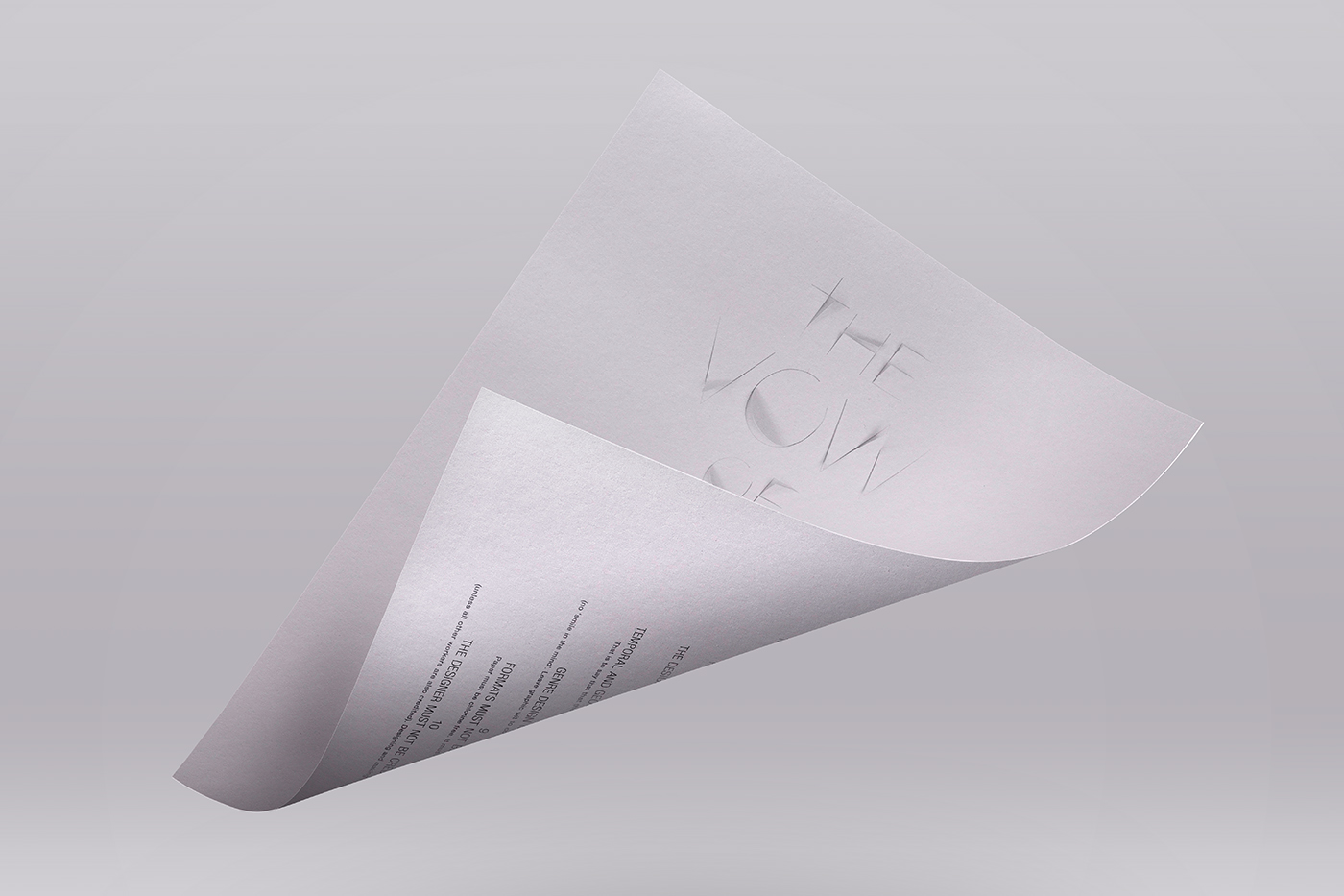
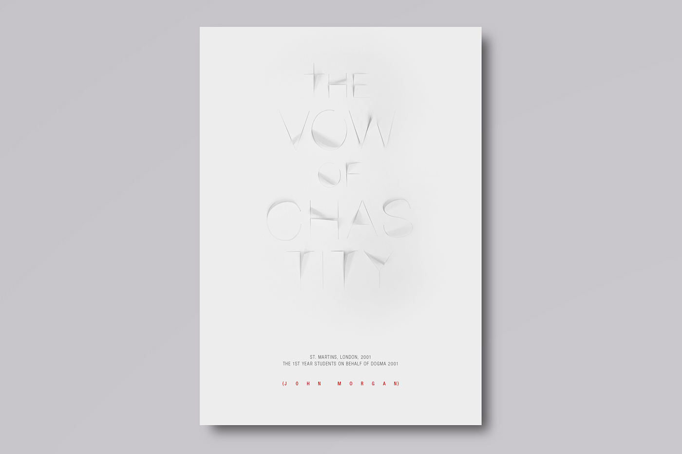
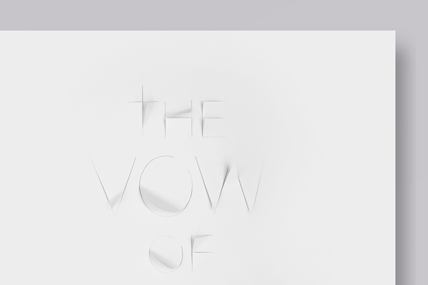
John Morgan adapted the original manifest of the same name to the world of Design, with the intent of creating an oath which his students had to oblige. The result contains inflexible rules about colors, sizes and formats, adopting an humoristic and ironic tone that is emphasized by the lettering created.

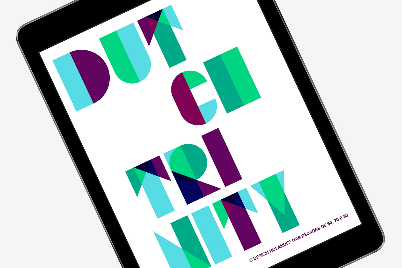
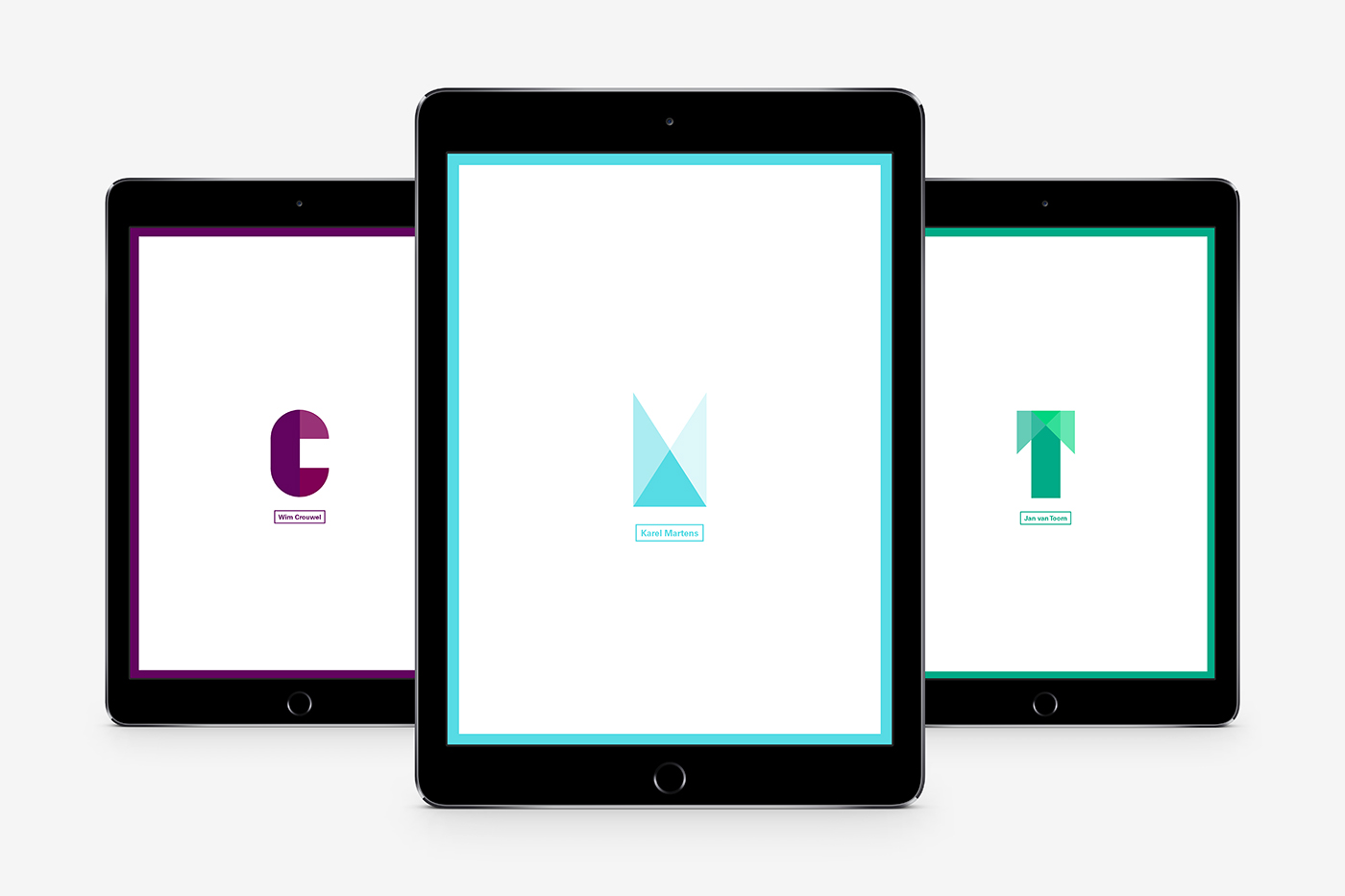
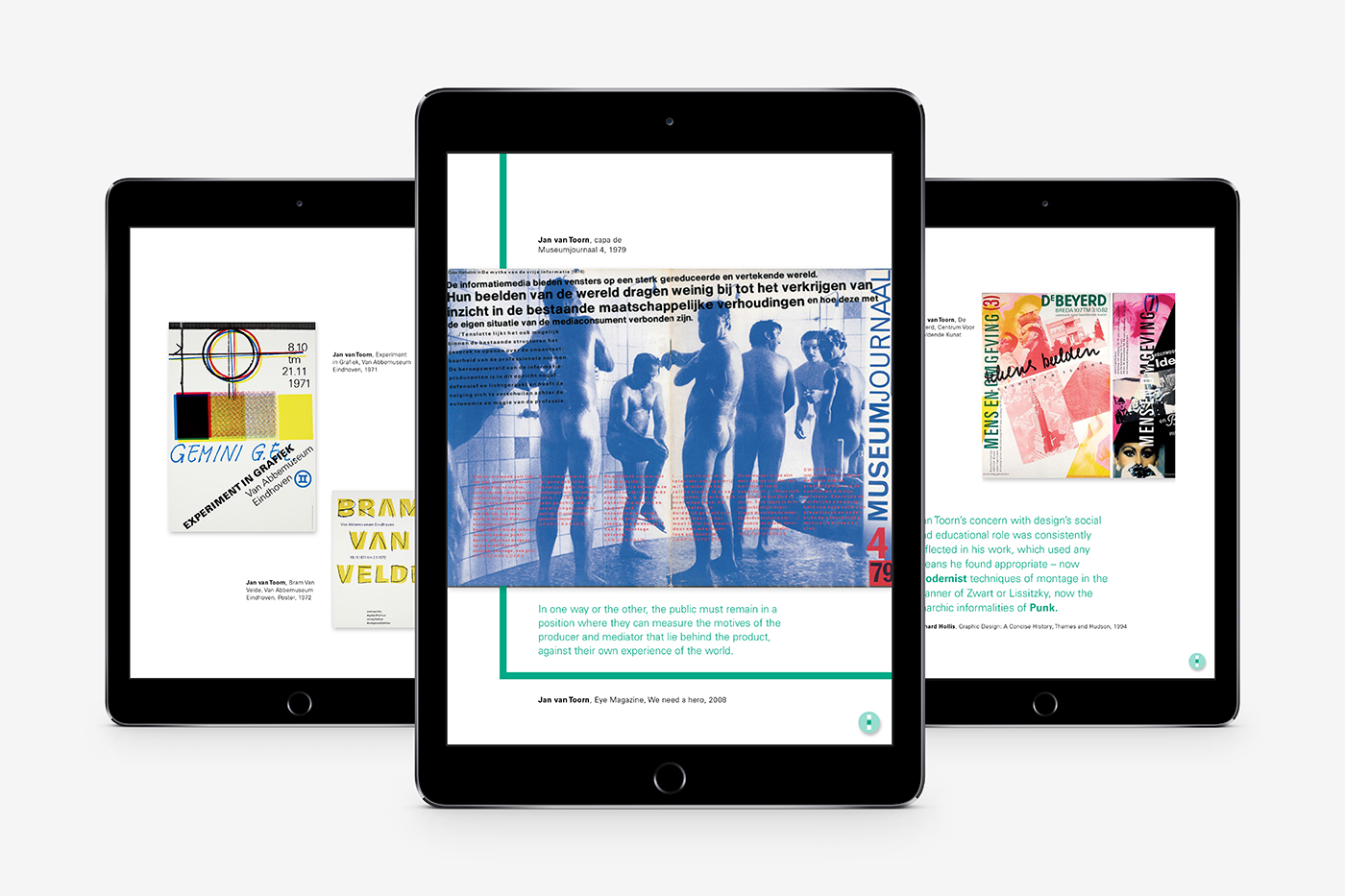
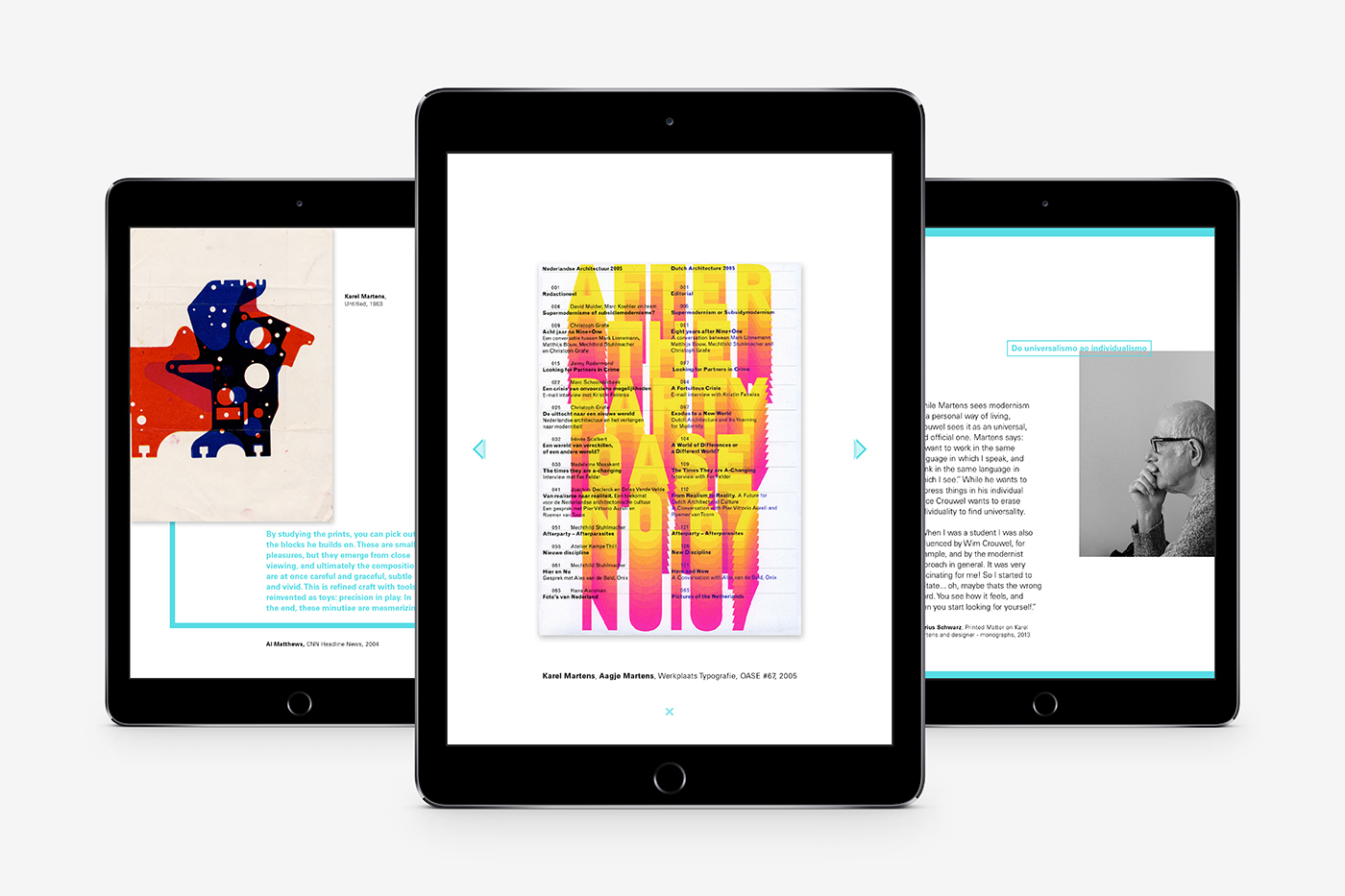
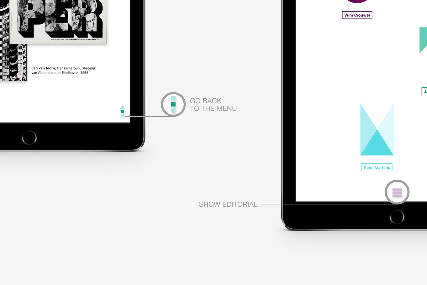
An e-book that focuses on the relation between three very distant Dutch graphic designers: Wim Crouwel, Jan Van Toorn and Karel Martens. To represent this trinity, the e-book is composed of three reading sections, each one dedicated to one designer. The geometrical lettering that was created inspired the layout and use of shapes throughout the publication.
[created w/ Beatriz Sapata & Raquel Sancho]